 |
| Mandrake's hand after first major battle |
When I asked Jesse if he had anything in mind, he mentioned a drawing of Mandrake's hand I had sketched a few years earlier. He also wanted a parchment background to give it a sense of age. In Liefdom, the main love interest is a fairy who inks the designs of butterfly wings. I wanted to also use colored ink splashes somehow.
Jesse wanted hand lettering for the title art and insisted on working with Chris Mostyn, a talented artist and friend. He was great to work with, very responsive. After a few initial sketches, he sent us this:
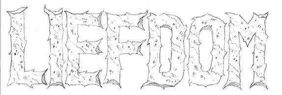 |
| Hand lettered title art by Chris Mostyn |
We put it all together and came up with a strong design that invokes struggle, pain, and beauty.
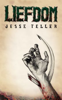 |
| Initial cover design |
However, after doing a bit of research and reading some fine print, we decided we needed a less bloody version! We tried taking off the red, but it lost impact in the process. For the final cover art, we eliminated the hand and brought in more splattered ink. The ink splashes are actually watercolor, with added saturation and multiplying done in Photoshop.
The dark lower portion of the cover begged for something to anchor it. I needed a brief line of copy to balance the title art. It was the perfect place to include a mention of Perilisc, the name of the continent in which the story takes place.
It's organic, tense, and beautiful. The spotlight behind the title adds contrast, and a sense of hope, while an inexplicable darkness creeps up from below.
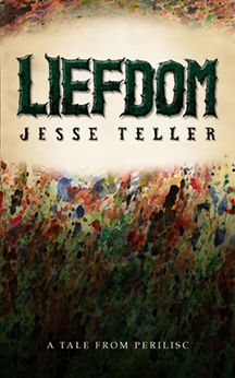 |
| Final cover design |
For more about Liefdom and Jesse Teller, visit his website.